The Idea: A Portfolio That Isn’t Boring
I always wanted a portfolio website that felt different—something interactive and fun instead of the usual static pages. I wanted it to reflect my personality and interests.
Version 1: Terminal-Based Portfolio
Being a linux entusiast, I decided to build a terminal-based portfolio that would look cool.
Challenges:
- Making it responsive for both desktop, mobile, tablet, etc.
- Navigation was difficult for non-technical users.
- Commands for navigation only appealed to terminal enthusiasts.
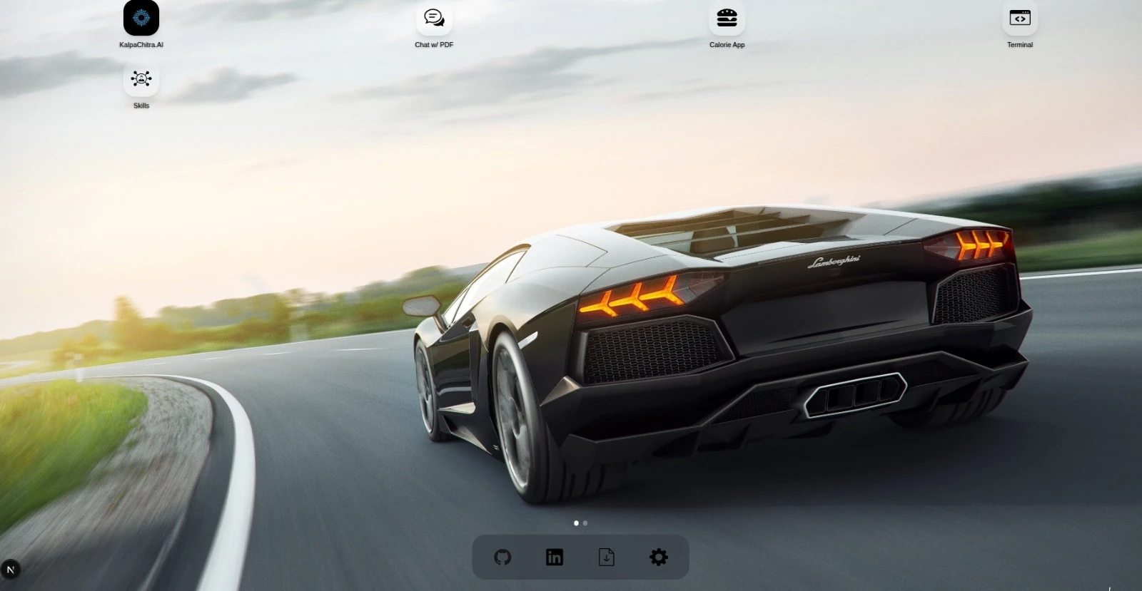
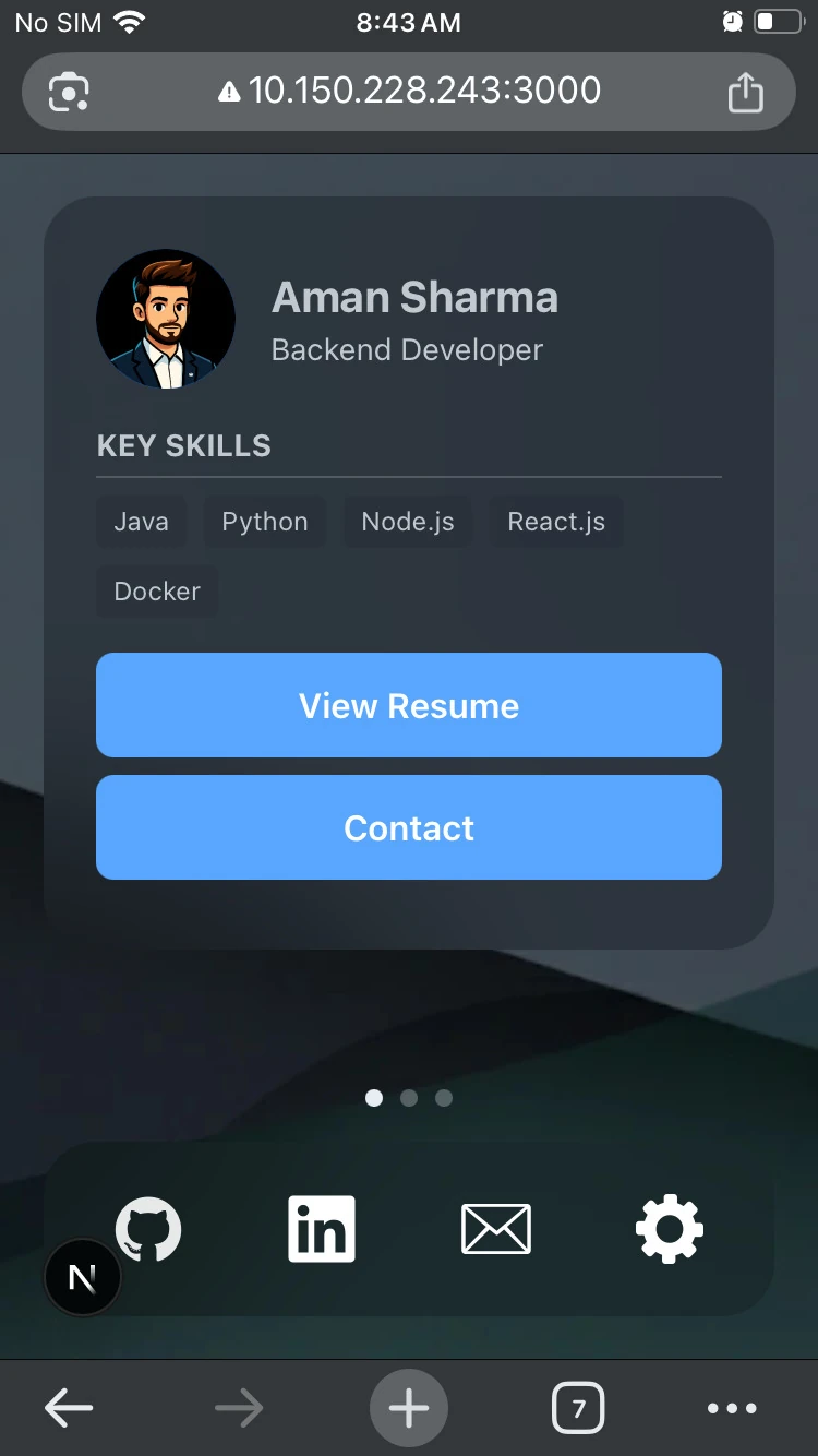
Version 2: OS-Styled Portfolio
So, here comes the second version, I decided to implement an OS styled portfolio.
Features:
- Includes projects, research articles, resume, and social profiles.
- Integrated the original terminal website as a feature.
- Built entirely in vanilla JavaScript.
Problem:
- Components weren’t reusable, making it hard to scale or maintain.
Version 3: Moving to Next.js
So, here comes the next version(pun intended). I chose Next.js for a few key reasons:
Why Next.js?
- SEO Optimization: Server-side rendering allows crawlers to properly index and rank the site.
- Component Reusability: Makes the codebase much more maintainable.
- Performance: Faster page loads and better developer experience.
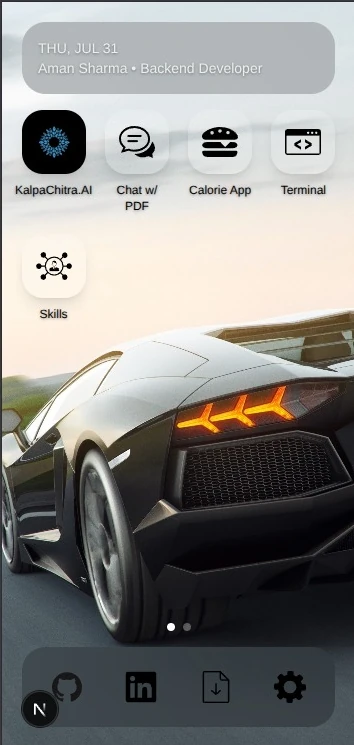
Responsive Design Challenges
The next big challenge was making the site work seamlessly across devices. Instead of relying purely on complex media queries, I decided to take a more direct approach: I created a dedicated desktop layout for larger screens and an optimized mobile version for smaller ones.
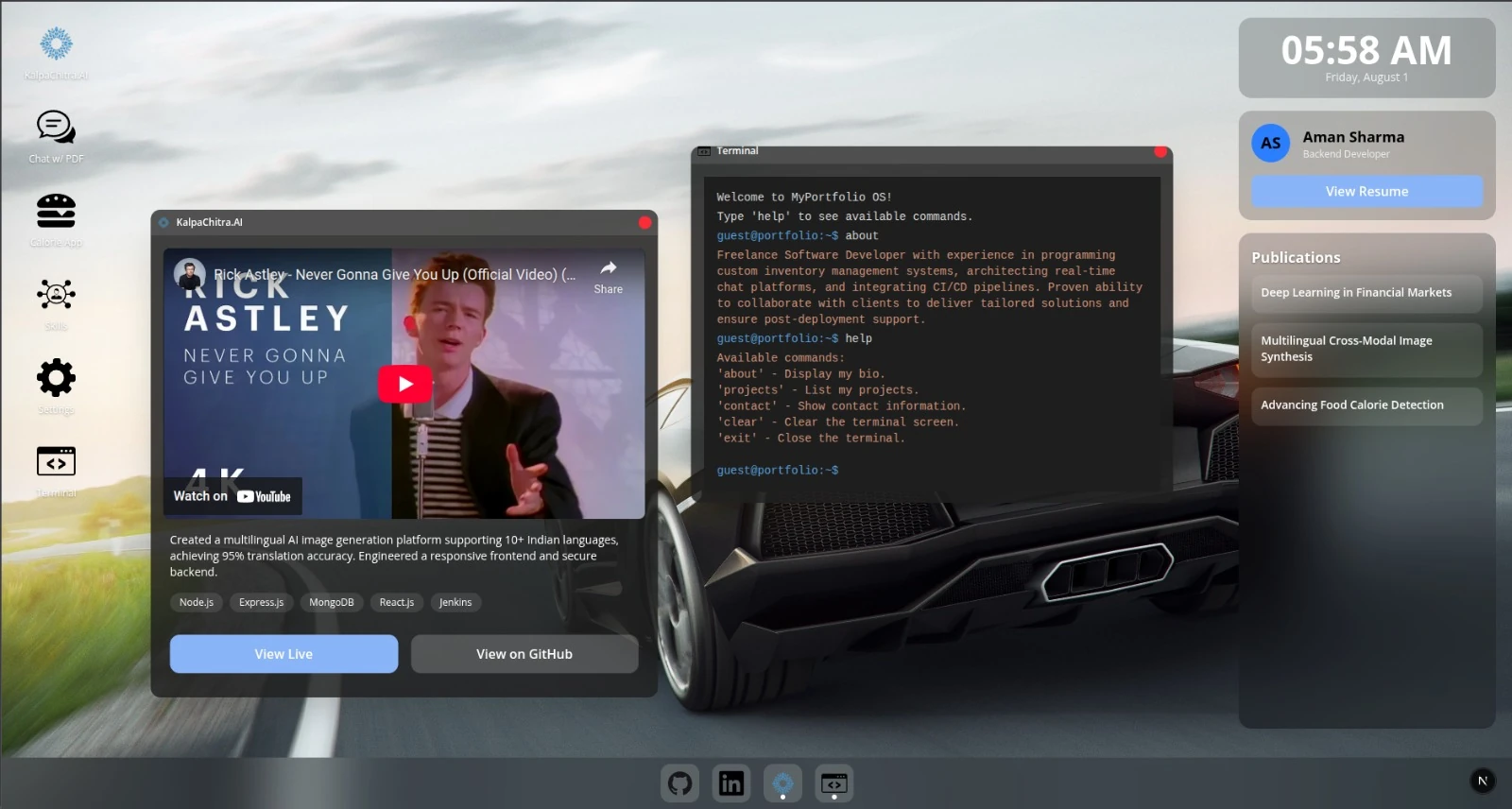
Additions:
- Window-based UI for projects and skills on desktop.
- Modals for the mobile experience.
Design Iterations: Feedback & Improvements
With the core layouts in place, I built the MVP and asked my friends to review it.
Issues Identified:
- Wallpaper was distracting.
- Overall design felt a bit incomplete.
- Needed cleaner UI and better visual hierarchy.
Fixes:
- Switched to a minimal wallpaper (with help from Gemini).
- Focused on the final visual polish to make both desktop and mobile versions look premium.
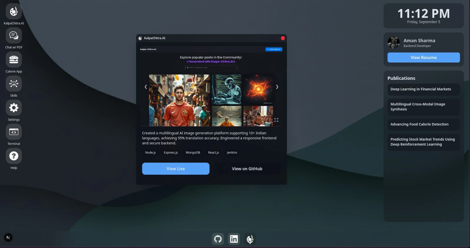
Supporting Both Light & Dark Modes
Dark mode is popular, but you can’t ignore users who prefer light mode. So I implemented both, ensuring a consistent design across both themes.
Launch & Initial Response
Now, it was ready. I started sharing it publicly across platforms, but didn’t get much attention initially.
Breakthrough on Reddit
Then randomly, I shared it on Reddit without any expectations. And it blew up:
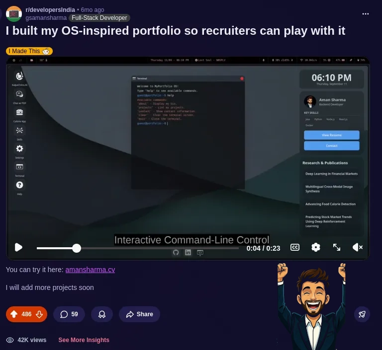
- The post reached the top 10 of the month.
- It received a lot of comments, feedback, and appreciation.
💡 The Next Idea: SaaS Product
That’s when I thought why not make a portfolio builder, so others could enter their data, make profiles and decided the Saas name to be showmy.page.
What Next?
This is just the beginning. A detailed blog on ShowMyPage is coming soon.
View the live portfolio at amansharma.cv